
Memodo Motion Design Guide
Why Motion Design?
Motion Design brings brands to life
Simplifying complex ideas
Animation excels at breaking down complex concepts into easily digestible visuals.

Grabbing attention
Make the videos stand out and attract the viewer’s attention

Boosting engagement
Animation keeps our audience entertained and invested and has the power to evoke emotions.

Building a unique brand identity
Animation should reflect our style and personality and make our content instantly recognizable to our audience
Enhancing professionalism
Animation elevates the video’s quality, giving them a polished, professional look.
Let's do this!
Let's dive deeper into our Memodo Motion Design.
Memodo Motion Design Values
These values inform how we approach motion design in all our projects.
Our easy recognizable and consistent Motion Design is a simple way to elevate information and communicate a feeling in a playful, cartoonish and bold way. Through a clear and confident Motion Design, we emphasize our reliability making complex information approachable.
This is how our Motion Design should look and feel:
Clear
Present complex ideas in ways that are easily understood.
Purposeful
Provide orientation and invite the user to interact.
Playful
Give technical information some heart with a friendly cartoonish look.
Bold
Capture the viewer’s attention and bring the brand to life.
Animation Principles
These Principles of Animation guide us and are observed directly from natural movements in life.
Anticipation
Anticipation is the energy or driving force behind any action. It adds life to your movement. Elements should have a realistic wind-up before large movements to prepare the viewer for the coming action.
Oscillation & Overshoot
These principles simulate the physics of gravity in real-world movements. Back-and-forth movements should decay over time. Animations should go a little beyond their final position, then settle back into that pose.
Offset
If multiple elements are animated on screen at once, then they should be offset to create randomness and a natural feel. Each object has its own unique inertia, avoid stopping them all at the same time.
Easing
Easing specifies the rate of change of a parameter over time. Instead of moving at a constant speed, objects with easing start slowly, speed up and slow down as they approach their destination. This creates a more natural and realistic flow.
While we don’t adhere to strict easing values, Memodo’s easing is often a strong ease in and ease out.
If something bursts out is has a different curve with a fast in and a slow ease out.
Secondary Actions
Emphasize the main action within a scene by adding an extra dimension to your characters and objects. These subtle motions respond to the primary animation and help convey physical properties such as weight, elasticity or inertia.
See below for more details.
Timing
Timing grounds your animation in realism, as everything will appear to follow the laws of physics. Think about the size and weight of your objects in relation to what and who are around them. Elements should always move quickly and with purpose.
Squash and Stretch
This animation principle exaggerates an object’s shape as it moves, giving it a sense of flexibility and weight. When an object impacts or accelerates, it squashes, and as it rebounds or speeds up, it stretches. This creates a dynamic, cartoon-like effect.
Arcs
This principle refers to the natural, curved pathway that objects follow when moving due to the influence of gravity and momentum.
On a technical note
Facts to keep in mind
2D
Matching our Memodo design style, only do animation in 2D
25 fps
Use a frame rate of 25 fps for animation projects in 4K/UHD
8 fps
Use a frame rate of 8 fps for GIF animation, used in newsletters or ad placements
Rounded corners
Corresponding to our design basics, always use rounded corners for paths and shapes
Stay bold
Say no to motion blur and opacity fades
Stay on brand
Check out our Memodo Design Guidelines and always keep them in mind when animating
See how we implement the Principles of Animation into our Memodo Motion Design
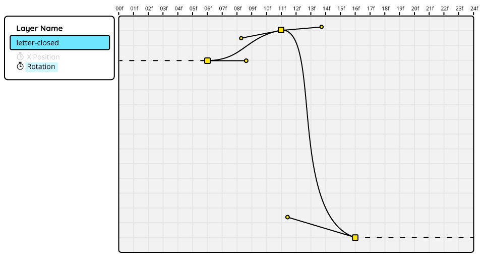
This animation demonstrates anticipation through changes in both the x-position and rotation properties. Before the email icon flies off to the right, it moves slightly to the leftand rotates clockwise ever so slightly. Notice how the animation curves for these properties are almost identical, and the value graph never flattens completely. Even at its slowest, the movement remains constant, giving the animation a dynamic quality.

Set of keyframes for x-position and rotation, usually with a duration of 5 frames.
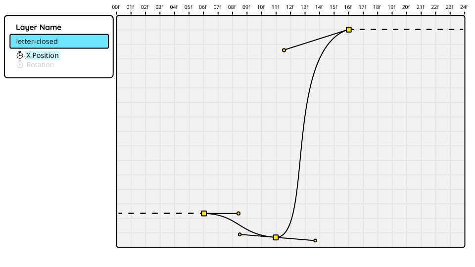
Value graph for rotation properties. The icon rotates clockwise ever so slightly (11f) before rotating anti clockwise (16f). Note that the anchor point handles are never in a complete horizontal position, hence the movement is never coming to a stop.
Almost identical value graph for x-position properties. It shows a short movement into the negative on the x-axis (11f) before flying off (16f).
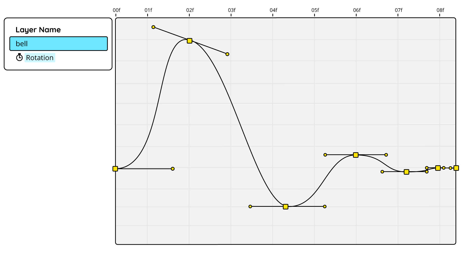
This animation shows a classic example of oscillation. The bell’s rotation displays a declining oscillation as it gradually comes to rest. Subtle oscillation like this adds an extra layer of life to animated objects and gives them a natural feel as they settle.

Distance between keyframes should decrease over time to mimic natural physics of oscillation.
The iPhone animation highlights overshoot in two ways. When the hand holding the iPhone enters the screen, it overshoots its final position slightly before settling back. Similarly, the blue rectangle in the background overshoots on the x-position before adjusting. While this example focuses on position, overshoot can also be applied to scale and rotation for equally effective results. Combining overshoot with other principles such as easing and oscillation, creates animations that feel natural and visually satisfying.

The overshoot happens on frame 12. The following decays for oscillation are usually on intervals of 6,4 & 2 frames.
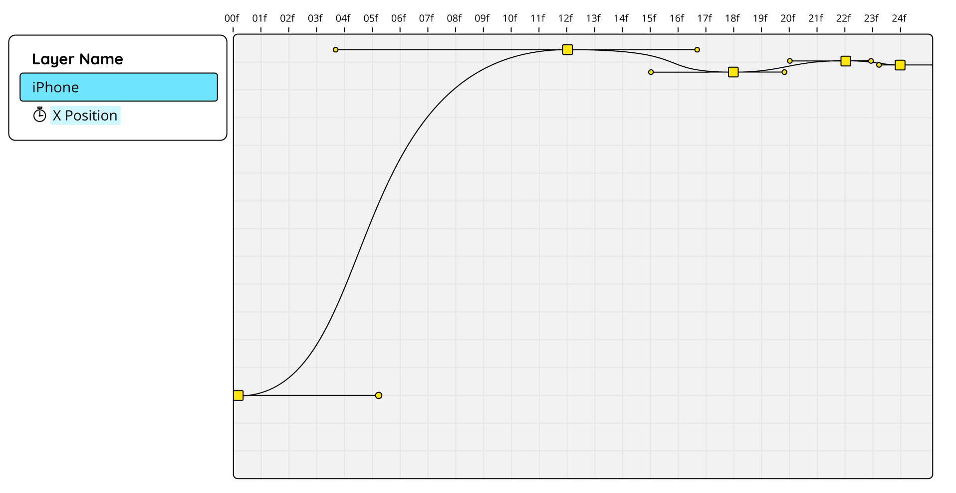
In this example, the overshoot principle (12f) is combined with the principle of oscillation (18f to 24f).
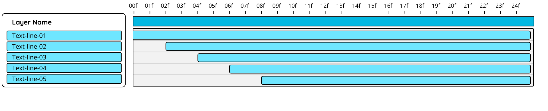
In this text box animation, offsetting adds a human touch. Each line of text follows the same animation curve, but the layers are offset by two frames. This minor adjustment makes the animation feel more organic and visually engaging with minimal effort.
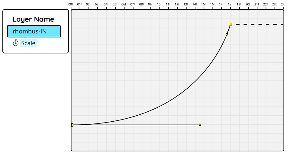
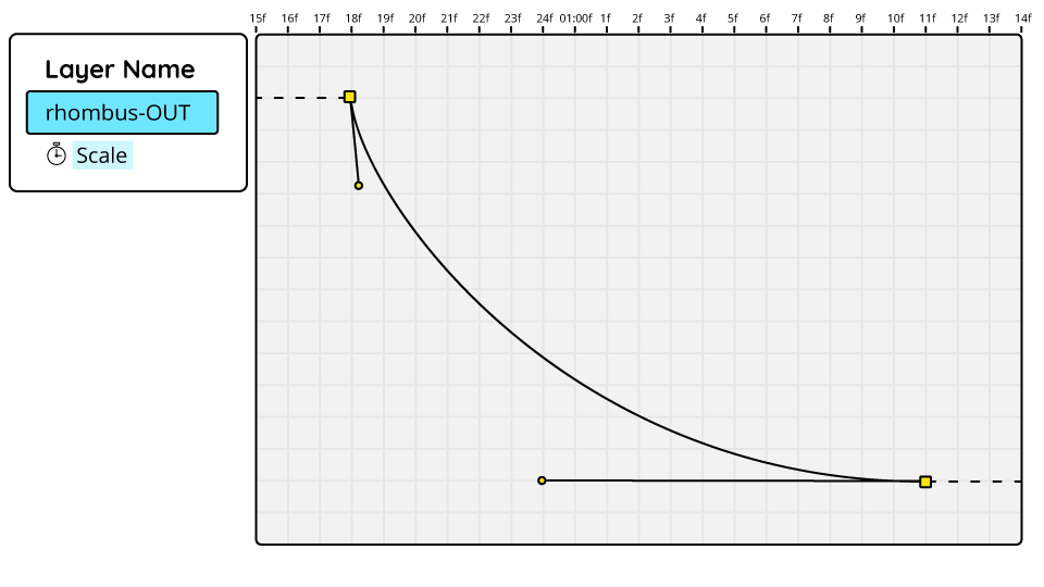
This rhombus swipe transition is a simple yet effective example of easing. The exaggerated ease-in and ease-out in the graph editor curves create a smooth motion. The shape layer is split, with the rhombus scaling from different anchor points on each layer. If the animation curves were both to appear on the same graph one after the other, they’d form a sharp-peaked mountain. This use of easing softens the transition between shots, making a “hard cut” less jarring.

In the laptop animation, details like speed lines when the laptop flies in, impact lines as it lands, and click lines from the cursor serve as examples of secondary action. These small embellishments add depth and polish to the animation, much like garnishing a dish to enhance its presentation.
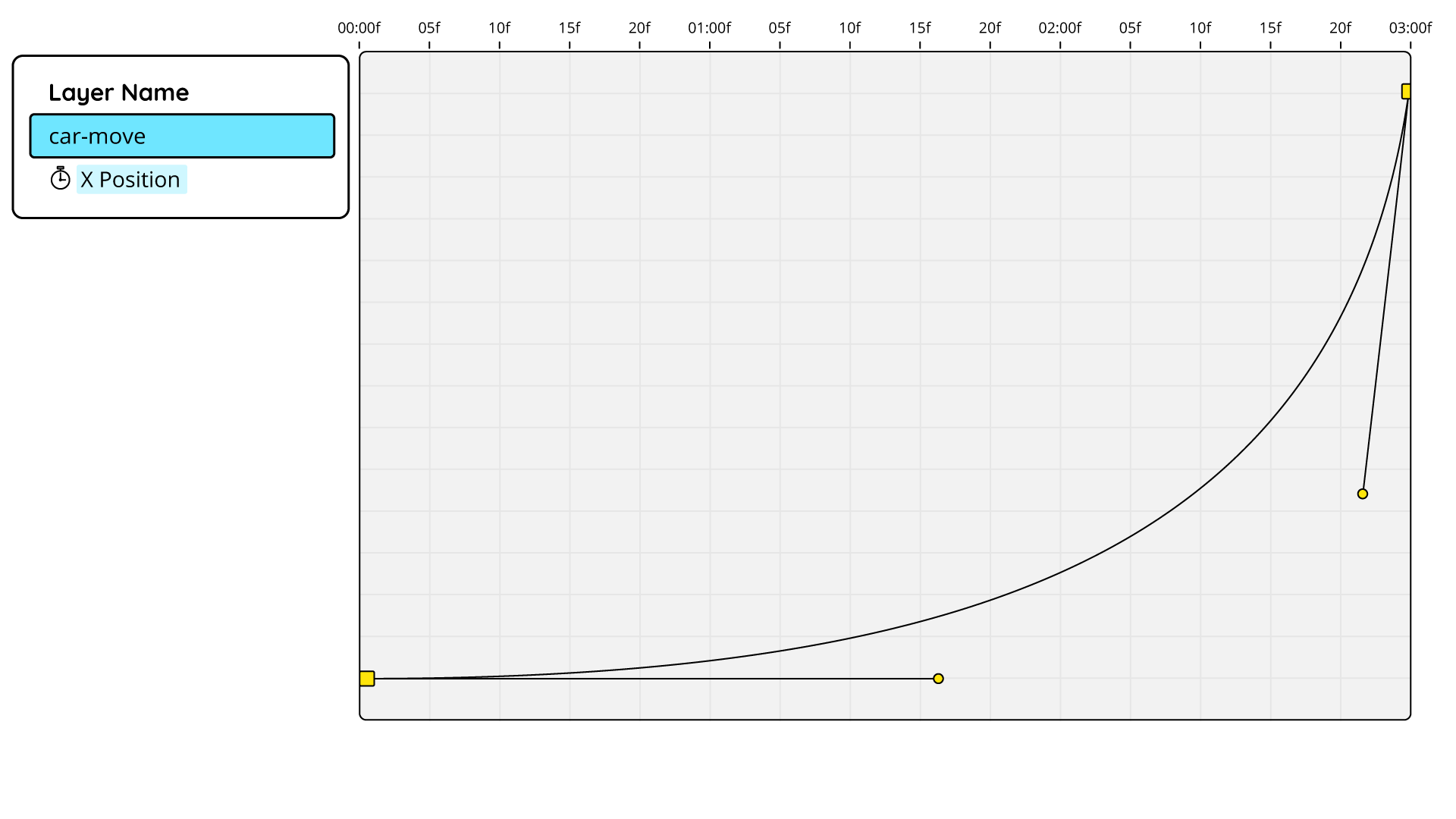
Timing refers to the duration between keyframes, often measured in frames or seconds. In this car animation, two keyframes on the x-position are spaced about three seconds apart. This extended duration allows for a drawn-out ease-in, mimicking the gradual acceleration of a car starting to move. Balancing timing with animation curves (spacing) gives animators control over the pacing and feel of the animation.
The jumping speech bubble icon in this animation demonstrates squash and stretch, emphasizing speed and impact. When squashed on one axis (e.g., x), an equal amount is stretched on the other axis (e.g., y) to maintain consistent volume. For example, if the x-scale is 110%, the y-scale should be 90%. This attention to detail enhances the illusion of flexibility and impact.




The paper plane animation demonstrates the principle of arcs. The plane moves along a smooth curved path, as does the dotted line trailing behind it, illustrating the flight path. Motion on arcs or curves is generally more visually appealing than straight-line movement and creates a sense of elegance.
Memodo Logo
In our Memodo Logo animation all important principles and values come to life.
This is how our Memodo logo pops up in a very playful, cartoonish and bold way, bringing the brand to life. Animation principles like Overshoot, Timing and Squash & Stretch are used to mimick natural movements and make the animation feel more alive.
The short logo animation can be used in any video format. This is the intro of choice.
Transitions
See how we design the transitions between different scenes
Colours swipe
The colours swipe is a simple but dynamic transition. It communicates our brand colors without distracting from the message of the video, keeping sure that it only underlines the content, not distracting from it. This transition can be used for every occasion.
Rhombus swipe
The rhombus swipe is a subtle way to blend between two scenes by using the core shape of the brand. This transition suits every video.
Car swipe
The car swipe is the most playful and entertaining way of transitioning between two scenes. It attracts more attention and gives the video a lively twist. It should only be used when it fits the tone of the video, not being too formal and technical.
Hand swipe
The hand swipe is a playful and engaging transition. It adds a lighthearted and human touch, giving even more technical content a fun and lively twist.
Text animation
This is how animated text should look and feel
Text animation should always be subtle and restrained. The preferred typeface is Quicksand Bold, often paired with a yellow text box to enhance contrast and draw attention where needed.
In most cases, text should move in blocks or lines, flowing naturally with the motion of surrounding elements. It should feel seamless and effortless—never drawing attention to itself. As a general rule: if the audience notices the text animation, it’s probably too much.
For special use cases, we have a predefined text animation preset. This uses After Effects’ built-in text animators to bring letters in individually, rising upward with the scale of each letter increasing to 100%. This style should be used sparingly and ideally in combination with a yellow text box. In this setup, the text animates in from left to right, using the box as a matte to reveal the letters progressively. Find the preset here.
MOGRTs
Motion Graphics Templates
Memodo MOGRTs are designed to be intuitive, flexible, and adaptable for editors and motion designers working in Premiere Pro and After Effects. To achieve this, we use a range of expression controllers (sliders, dropdown menus, and checkboxes) to offer clear, editor-friendly customisation options.
Animations should respond dynamically to content changes. For example, the size of a speech bubble adapts automatically to the text length using expressions like sourceRectAtTime, with built-in padding for visual consistency.
Key adaptability features include:
Colour Control
Switch between defined colour schemes (e.g. Memodo Blue to Memodo Yellow). This is often achieved with if/else expressions.
Visibility toggles
Enable or disable backgrounds or other elements via checkboxes. This is often achieved with if/else expressions on the opacity property.
Flexible timing
Define protected regions at the beginning and end of each MOGRT so editors can adjust duration by dragging in the Premiere timeline (e.g. speech bubbles staying on screen for 4 or 7 seconds).
Media replacement
Allows the editor to switch photos or videos in an animation.
Randomisation
Add natural variation using sliders.
Transition options
Provide controls to either animate out or match-cut to the next element.
For templates with non-obvious functionality, include a short instructional text within the MOGRT itself to guide editors during use.
To see the Memodo MOGRTS in action have a look at this internal how-to video:
Find our MOGRTs library here.
Sound Effects (SFX)
Sound design plays a supporting role in Memodo Motion Design. Our SFX should feel light, natural, and playful — enhancing the motion without overpowering the overall piece.
Use sound selectively
Not every animation needs to be accompanied by a sound effect; focus instead on key moments that benefit from a bit of sonic emphasis.
Keep the mix subtle
SFX should sit comfortably in the background, adding texture and clarity to the motion, never distracting from voice-over, music, or dialogue.
Sync SFX to MOGRTs
Where possible, export SFX to match the in and out points of MOGRTs (e.g. Name-tag in and Name-tag out), making integration smoother for editors.
Ensure sonic consistency
All SFX used within the same piece should feel sonically cohesive. Avoid combining sounds with wildly different acoustic characteristics — for example, a reverb-heavy sound that feels like it was recorded in a car park won’t sit well next to a dry, close-mic’d sound from a small room.